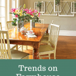
Trends on Farmhouse Paint Colors

I often see articles by paint companies claiming to have the exclusive on the year’s hottest farmhouse paint colors. But the colors vary widely from source to source. And one thing is constant: these farmhouse paint colors are rarely the wall color of choice for an average consumer. There are some exceptions (like SW Alabaster). But often the latest “trend” according to someone high-up in the industry is the very color that an average homeowner just painted over in disgust.
The general public has a very different opinion of what they want in their homes than do “tastemaking” designers, who are years ahead of the comfort level of everyone else. Real trends actually come as a reaction against the way “normal” things were done the decade before. Once everyone accepts the trend as “normal” (like gray paint on walls, for example), people start thinking that they’d like to try something different and wonder what’s next.
Color Trends
One misconception about paint color trends is that any paint color that is promoted as “trendy” is meant for walls. In real life, we don’t tend to want our homes to look like crayon boxes. Not that it hasn’t been done…remember the bright red dining rooms from a decade ago? That’s because a fondness for a particular color (like red) made us think we should go to the paint store and buy enough to cover the walls. Then when it was done, we realized it wasn’t so great but didn’t know what to do about it.
Here’s what you do about it.
Think of your home as a whole design. So often we have clients saying they want to choose new farmhouse paint colors before they have chosen anything else. Never do that. Since there are 2.5 zillion paint colors, choose it last and pick your upholstery fabric first or your rug or your tile. We have actually had clients shopping for things that don’t exist because in their mind, something in their imagination is the only thing that works in their space. This is frustrating for them and for the poor sucker (me, the interior designer) trying to explain to them that you can only buy what retailers offer unless you want to have something custom-designed. Design with what you can actually get first, and then choose the paint color to coordinate.
Farmhouse Paint Colors I Love
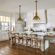
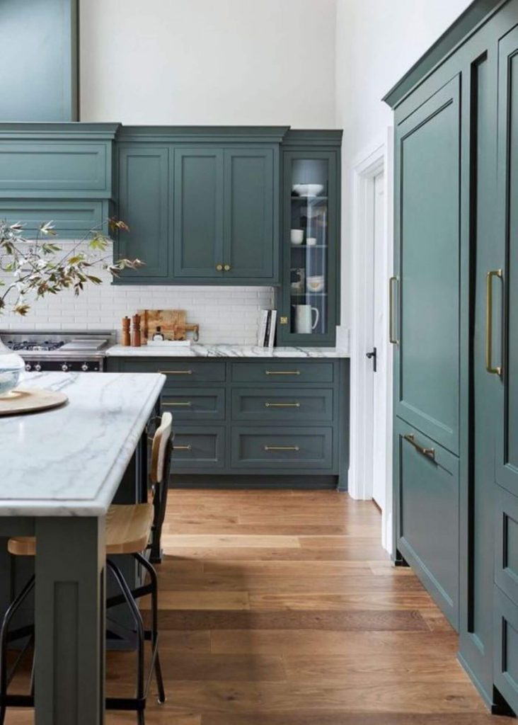
My favorite color trends at the moment come as a reaction to the previous trend, which was white everywhere. I still love white everywhere, as long as there are many different whites involved. But there was a time when everyone did all-white kitchens, and now we’re seeing darker, moodier cabinet colors like grayed-greens and blues. If you love the look of those dark colors, find smaller, high-impact ways to use them rather than painting all your walls those colors. These colors look great when mixed with lighter neutrals for contrast.
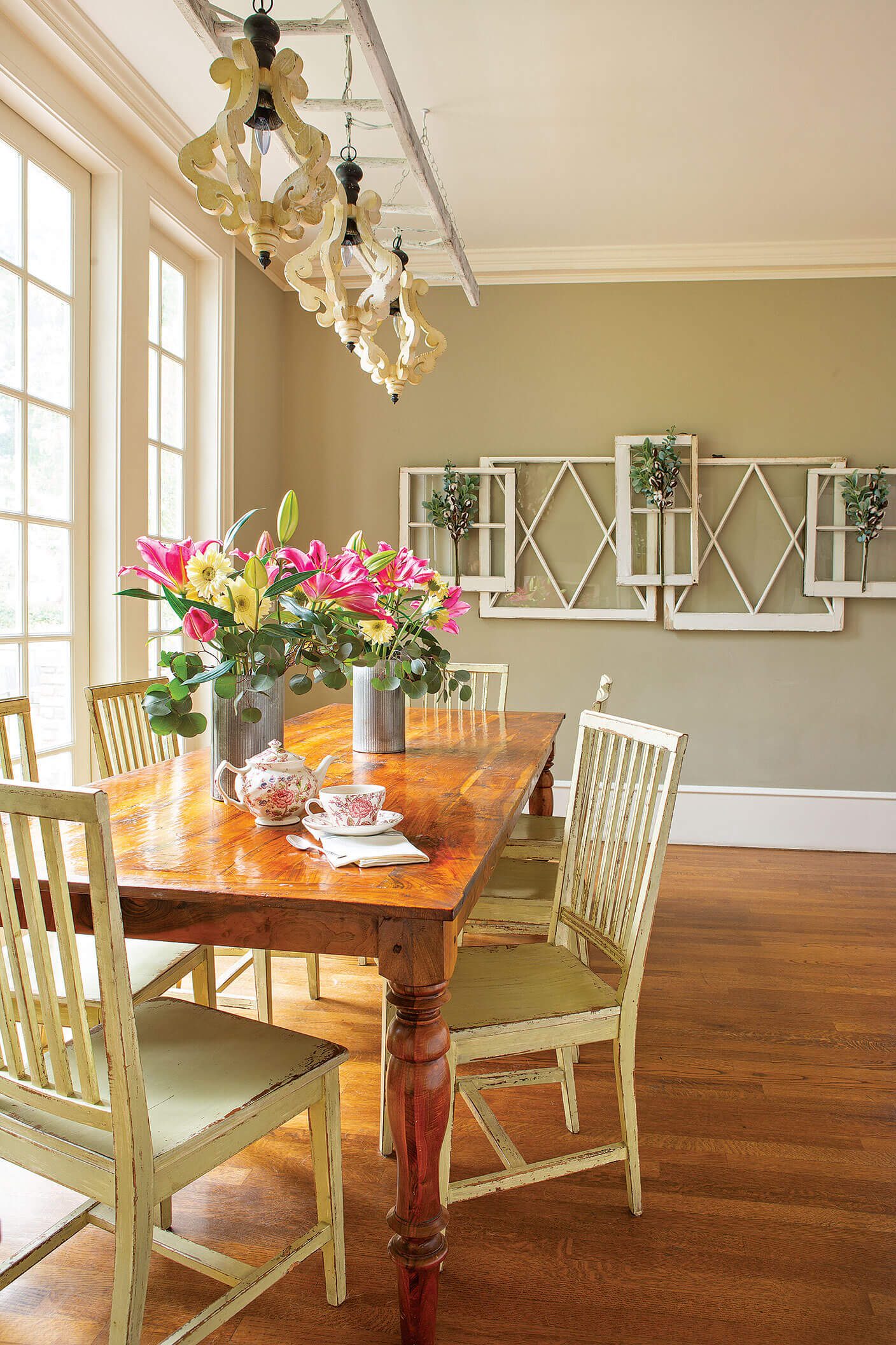
Keep Walls Mostly Neutral
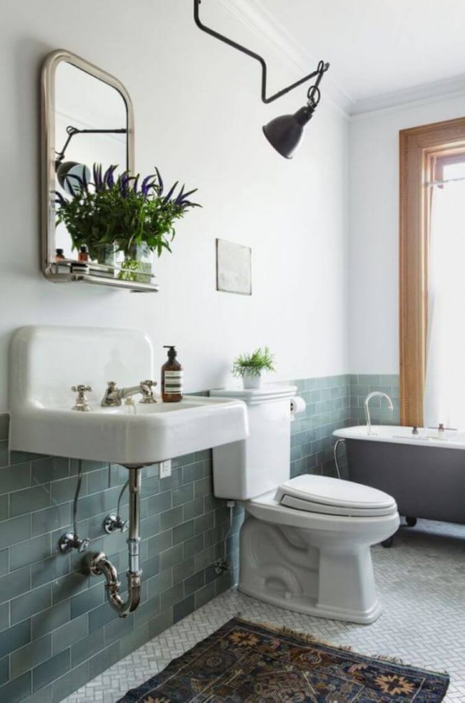
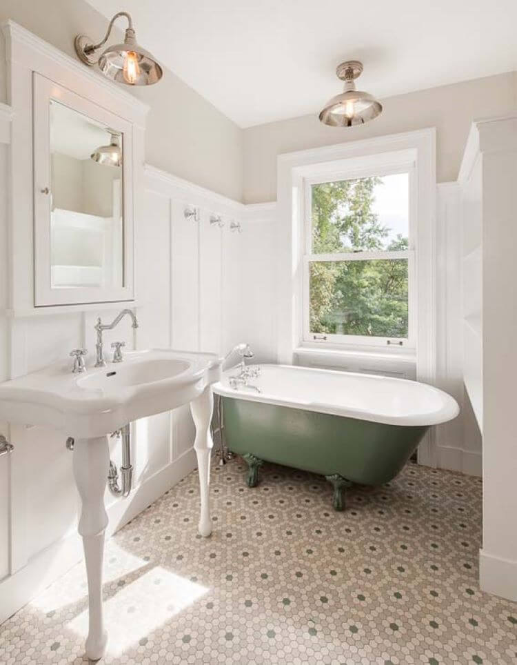
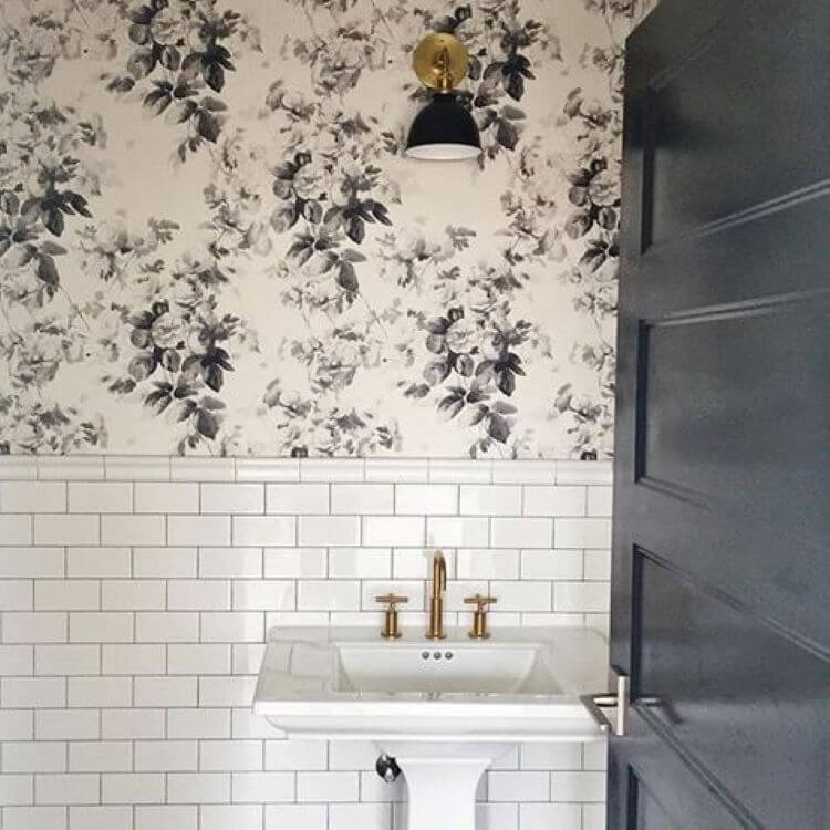
We recently designed a bathroom with a dark, gray-green subway tile wainscot and white walls above. The tile will be used in a relatively small amount, but will have a big impact. The homeowner sent me an inspiration picture of a kitchen with a similar grayed-evergreen color, and we translated it into her bath by bringing in the color with the tile and using wood vanities. Using green cabinetry in the bath wouldn’t have gotten the same look, since there wasn’t enough cabinetry to pull the color through the space like it was in the inspiration picture. Or, you could keep the walls entirely neutral and use your dark, dusky green on the tub.
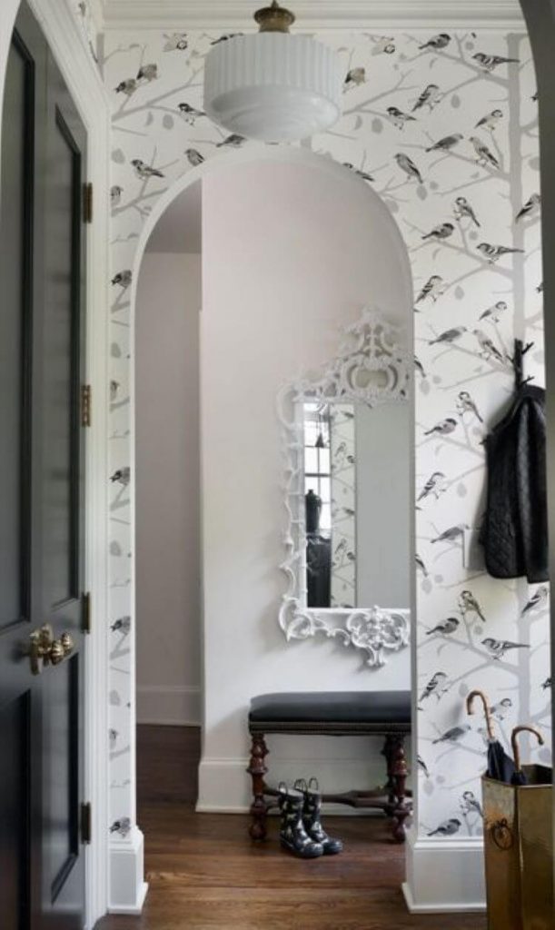
Use Wallpaper
If you’re using a dark color in a small dose, like in wainscoting, choose a wallpaper to go above it that picks out the color. This will get you an all-over professionally-designed look without much difficulty. Then, just add a nice-quality rug, like a Turkish rug for the floor, plop your furniture back on it, and you have a winner.
Keep it Light
While my favorite new colors are the dark charcoals, blues and greens, in most rooms they should be balanced with light colors unless you like living in a cave. If you want to make one or two rooms dark from floor to ceiling, that’s fine and could be cozy. Just don’t get too excited and paint your interior this way or you may be repainting shortly.
What about Gray?
The beige trend of the 2000s changed into the gray trend of the 2010s…and now we’re at the end of the 2010s. Also, one of the “colors of the year” mentioned above is actually beige. So do we all paint our walls back to beige even though some of us JUST painted them gray?
I don’t think so. Wall color should be a backdrop to an all-over design and not the focal point anyway. Figure out what you’re doing with your furnishings first (do you hate your rug? Start there before worrying about wall color). Once you figure out what colors and materials you want your room in general, it’s time to choose a paint color that’ll be a nice backdrop to your design. Beige? White? Gray? Light blue? Whatever, as long as it complements your furnishings.
What about Bright Colors?
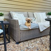
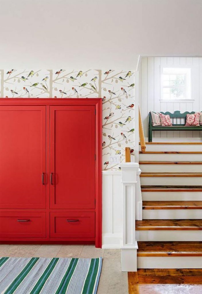
To me, bright colors are fun but not my favorite farmhouse paint colors for walls. This is usually because the bright wall color hasn’t been tied into the furnishings well and is overwhelming. Unless you’re a design genius, bright colors are better in smaller pops. If you are loving them at the moment, get them through art, pillows, bedding or dishes rather than making your home look like a tween-haven. Or, choose wallpaper that has small amounts of bright colors in it, like this wallpaper from Schumacher. The brightly-painted cabinetry is just the right amount of color, along with the wallpaper, that won’t overwhelm the space.
You could also choose a toned-down version of the same wallpaper and use a dark, neutral paint color to get a bit of drama without the brightness.
Your home’s paint colors can also impact its market worth. Learn these tips to increase your home’s resale value. Of course, don’t forget to follow us on Instagram, Facebook and Pinterest to get your daily dose of farmhouse inspiration!

Holly Thompson is a designer in the Nashville area. She and her husband Dave own Holly Thompson Homes, a kitchen/bath showroom/interior design studio in a 200-year-old building in Historic downtown Franklin. They are a husband-and-wife design and renovation team, partnering with local contractors and builders to make Holly’s designs come to life. Their home was featured in American Farmhouse Style in Fall 2017. They also have three kids and two kitties. Follow along with Holly and Dave on Instagram and Facebook and on their blog.