Decorating with Floral Patterns
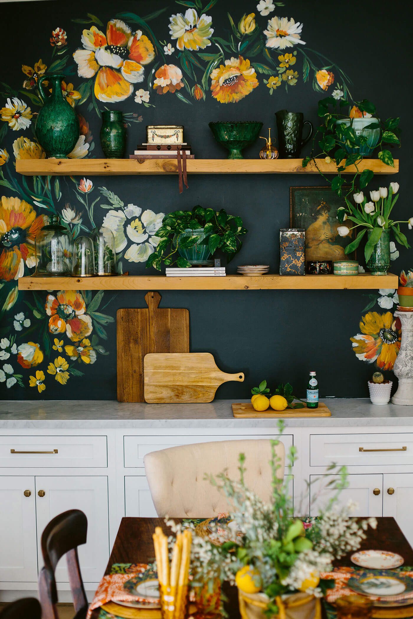
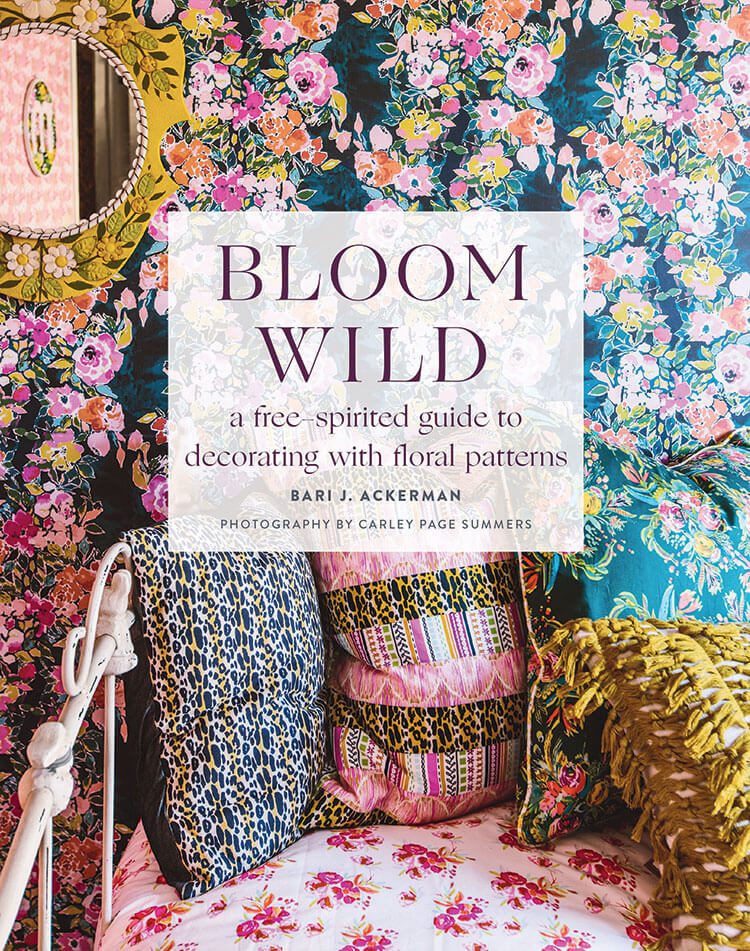
Floral patterns are beautiful, but they can also be intimidating. Certain combinations look garish instead of gorgeous, so many of us stay away from adding them to our homes. But author Bari J. Ackerman is here to share how to add tasteful floral patterns in her new book, Bloom Wild: A free-spirited guide to decorating with floral patterns. “Forget your worries about what goes with what, looking too granny, or looking too wild, and get ready to dive in,” she writes. Here are her tried-and-true tips for getting the most out of floral patterns in your home.
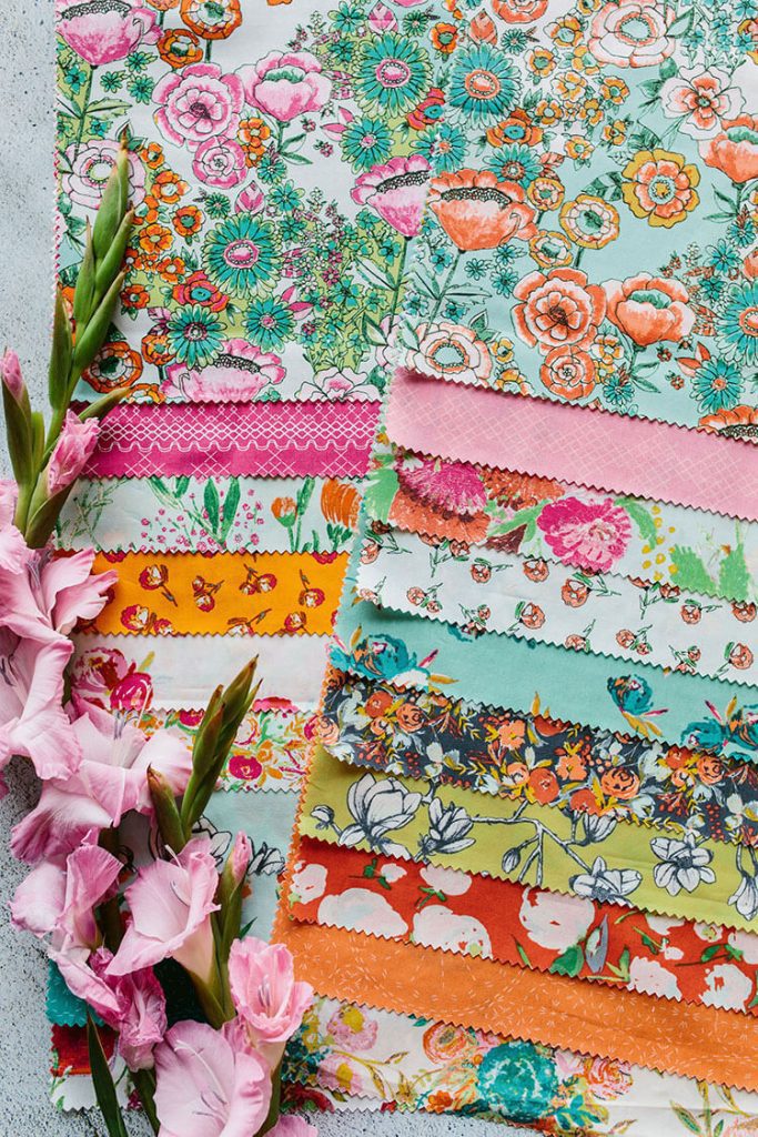
Step 1: Find What You Love
The first step is to explore the world around you to help determine what you love. “Begin by exploring the immediate world around you,” Bari writes. Visit your local park, museum, book store and flower store and notice what catches your eye. Is it a certain color or color combination? Is it a specific species of flower, or shape of the petals? How about the size of the flower? Take all these elements into account when you start looking for floral patterns in your home.
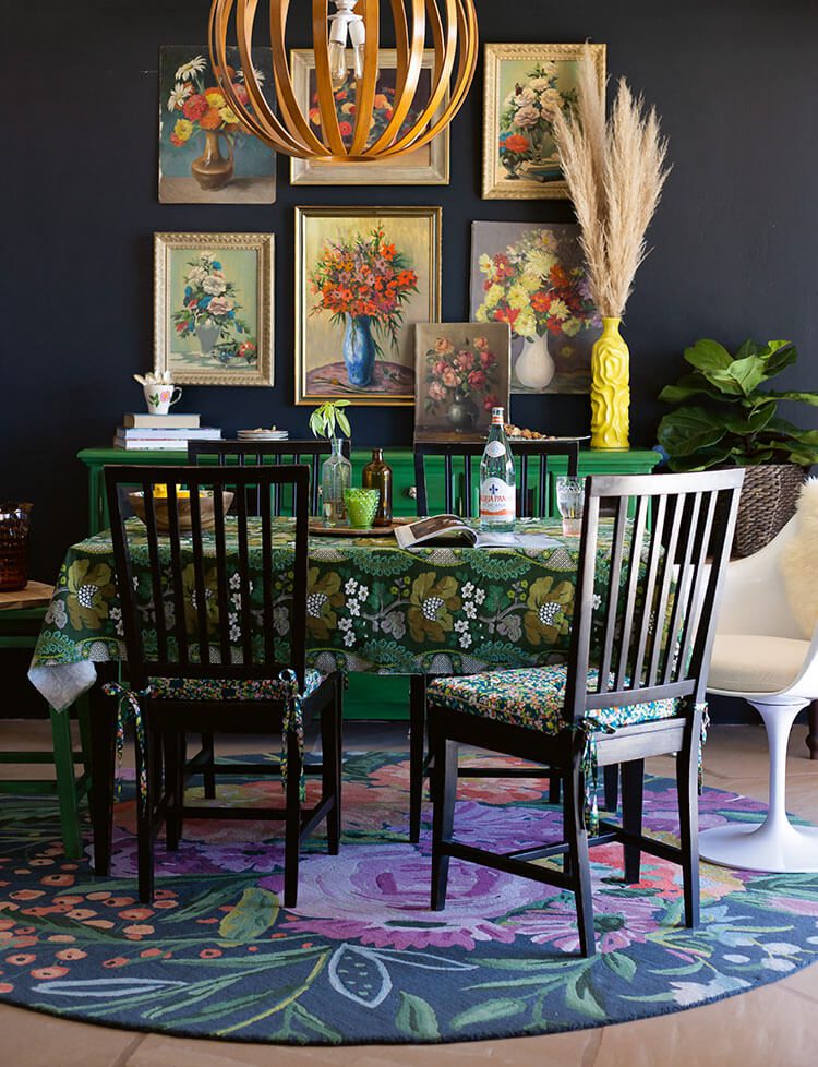
Step 2: Mix and Match
Bari designs both floral prints and fabrics, and has reached several formulas in her design process. She has three different kind of prints that go well together. “I think of the prints as a ‘hero’ (the main event), a ‘ditzy’ (small flowers), or a ‘stripe’—and a great floral design mixes all three together,” she writes. When deciding on a floral pattern, start with your “hero,” a large-scale floral pattern that will be the focal point of the design.
Next comes the “ditzy,” which is a small-scale repeating pattern. “When you pair a large-scale floral with a ditzy, you have a beautiful contrast,” Bari writes. Finally, add in other solids and stripes that will complement your florals. “Florals go with stripes and leopard print goes with anything,” she writes.
Bari also has a “magic equation” to design with florals, which she calls contrast and through lines. “When mixing and matching on your own, think about contrasts and through lines,” she writes. Contrast means that two patterns are different enough from each other to not compete. “When you mix a large floral with a tiny floral, there is contrast between the two,” Bari writes. Contrast can also come through color, shape and graphic type.
But you don’t want patterns that are so different that they look disjointed. “There should also be something that ties them together—I call this a through line,” Bari writes. “If there is a similar shape or color tying the two together (the through line), that makes it a great match.” Find colors, shapes and motif types that are similar throughout the design to make them cohesive together.
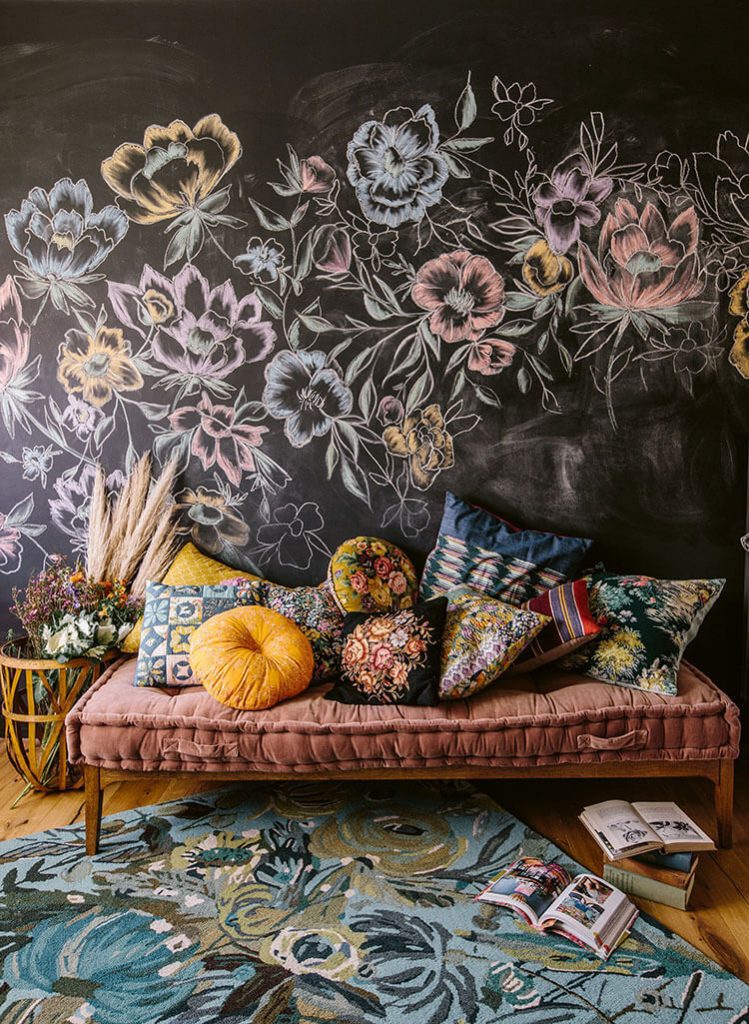
Step 3: Explore
Use Bari’s formula to get you started, but then deviate when something catches your eye. “Do what speaks to you,” she writes. “You’ll learn to refine and edit as you go along.” If you get a design together and find that you don’t love it after a few months in your home, try changing out one pattern to see if that’s the puzzle piece that didn’t quite fit right. In the end, it’s your eye that will be the best judge of what you love in your own home.
Love looking at colors? Find out if gray is outdated! Of course, don’t forget to follow us on Instagram, Facebook and Pinterest to get your daily dose of farmhouse inspiration!
Victoria is a brand advisor, marketing strategist, writer and editor. She was the editorial director of American Farmhouse Style for almost 10 years, and now enjoys writing occasional articles for the magazine and receiving the beautiful copies in the mail. Victoria is also a wife and mom to three little ones: two on earth and one in heaven. With any (not so spare) time, she devours books, dabbles in fiction writing and works on her house. As a home décor enthusiast and DIYer herself, she knows what a little paint and patience can do for a room!

