A Home Goes From Builder Grade to Custom Charm with DIY renovations
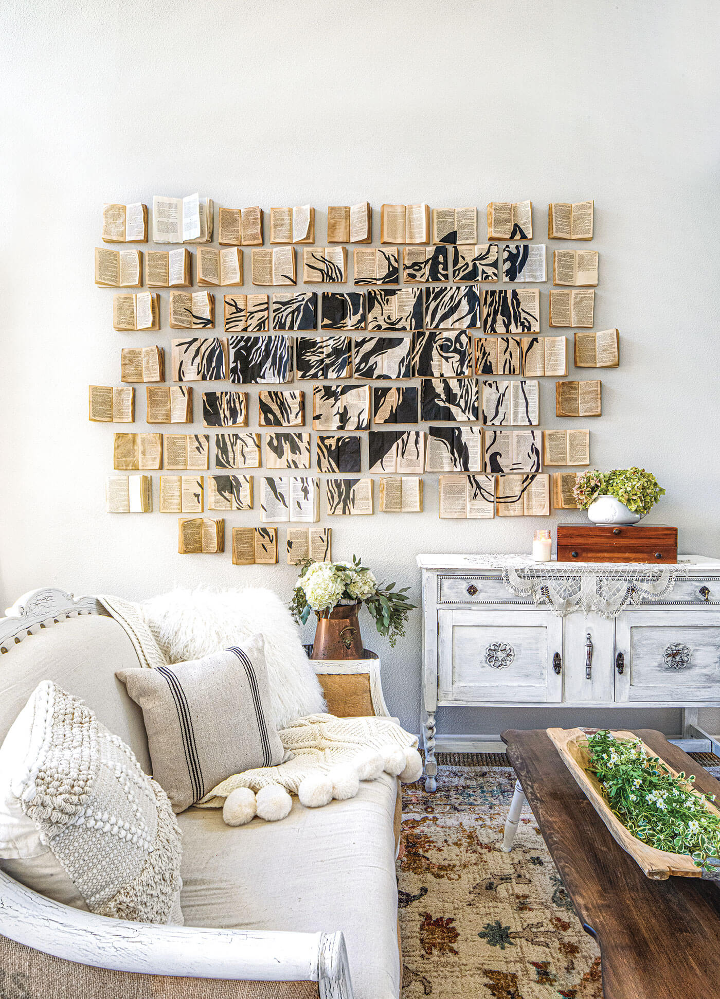
This California home shows how to use DIY renovations to breathe life into the bare bones of builder-grade architecture for custom charm.
Before Ana Ochoa, an attorney and blogger at Sunrise Valley Farm Co, moved into her suburban Southern California home with her husband and pup, DIY renovations were an unknown territory. She’d never tiled a backsplash or used anything more than a handsaw to create custom charm.
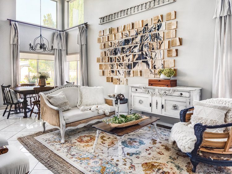
However, she knew she wanted to transform their builder-grade home into the vintage farmhouse of her dreams—and was determined to learn as she went. “I’ve always loved home styling and crafting, but this house was my first foray into real home renovation,” she says. “Now I’ve tried pretty much every power tool out there.”
“Just go for it,” she says. “My DIY renovations’ motto is ‘Everything can be fixed.’ So if you make a mistake or don’t like something after the fact, you can always change it.”
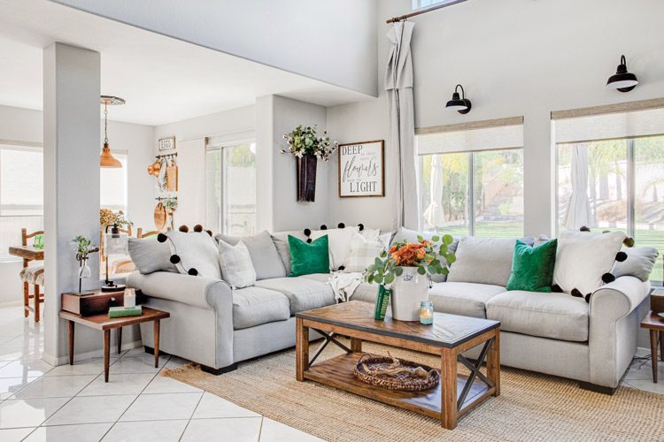
As she journeyed through DIY renovations and interior styling, she decided to share her experiences for other aspiring home renovators through her blog and Instagram account, Fiddle Leaf Interiors. “I’ve also always loved writing, so combining that with my love of DIY renovations was really the perfect match!” she says. Here’s how she turned their neutral, basic home into a charming, customized farmhouse.
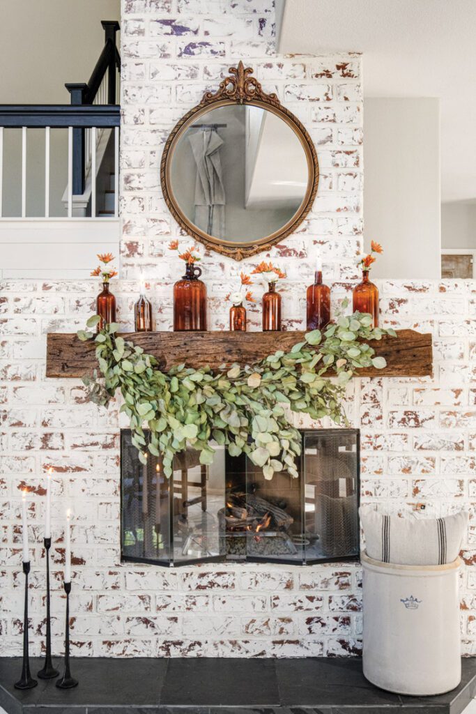
From Basic to Beautiful
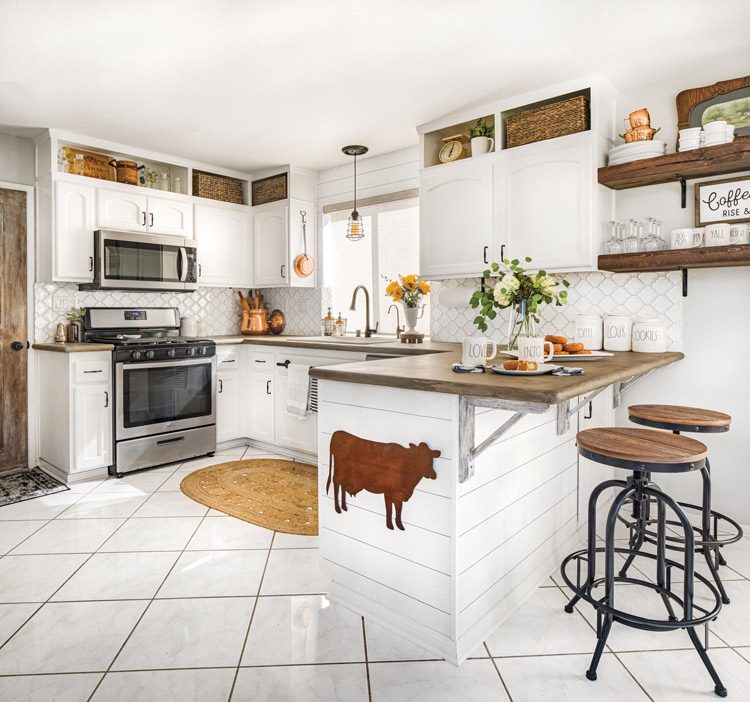
Originally everything in the kitchen was painted a dismal shade of brown, from the cabinets to the counters and backsplash. “It was a brown cave,” Ana says. “Because the kitchen is so small, it looked even smaller with all the dark color.”
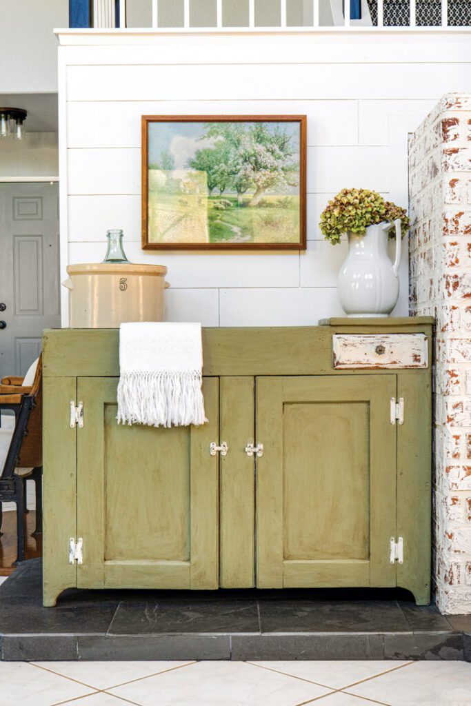
Despite their lack of experience, Ana and her husband jumped right into a kitchen makeover and did it all in six weeks to create custom charm. “It was challenging and was the first real major renovation we’d ever done, so there was a learning curve,” she says.
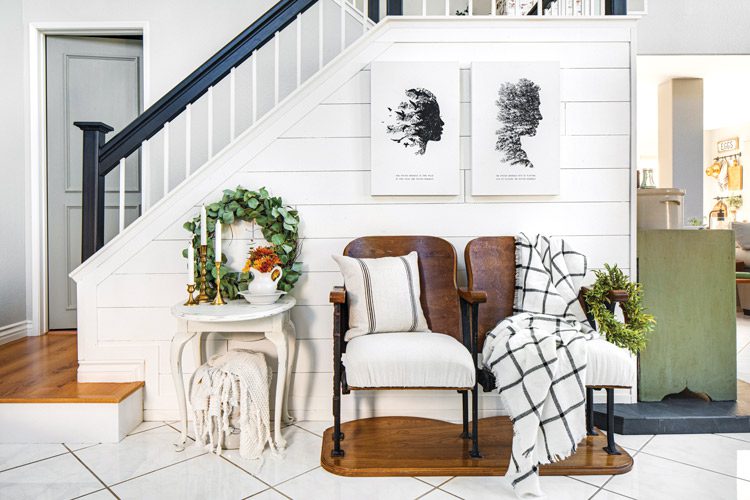
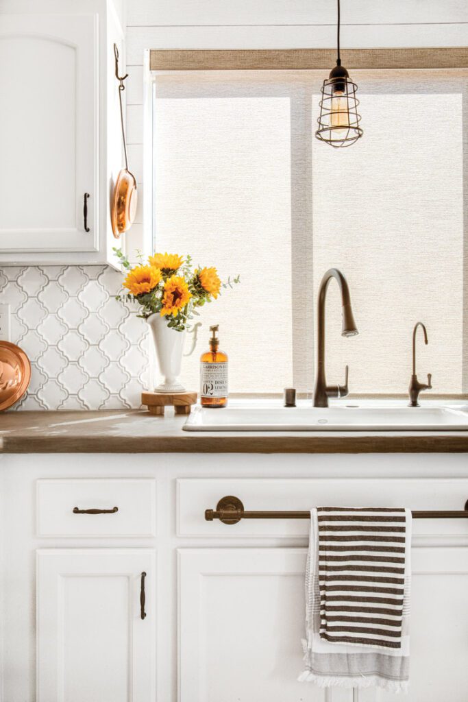
The list of kitchen changes is staggeringly impressive. They extended the cabinets to the ceiling; changed the sink, faucets and hardware; refinished the counters and installed a backsplash.
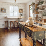
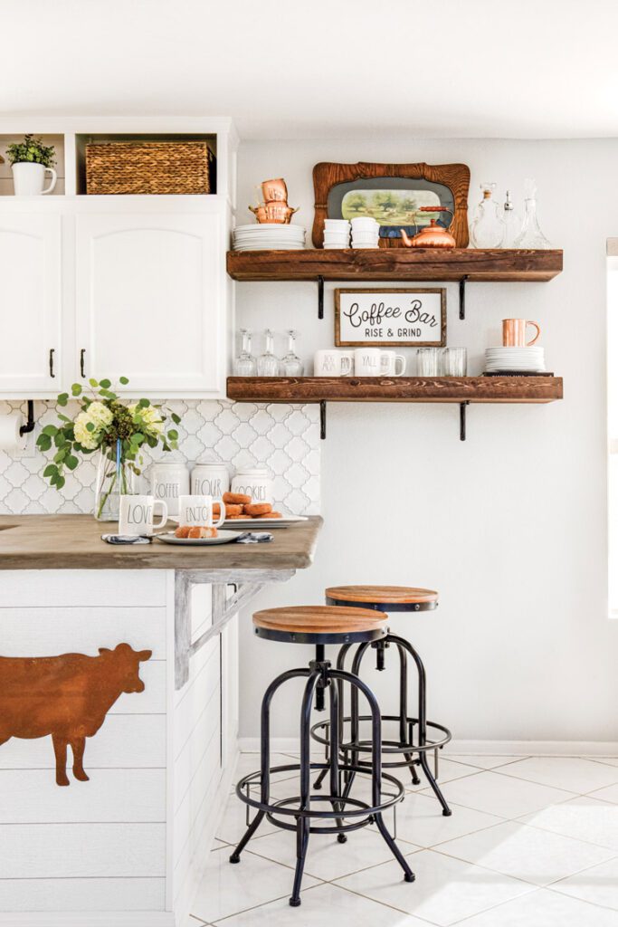
Then Ana styled the kitchen, giving it the custom charm that’s so synonymous with farmhouse décor. Copper accents—“I can never have enough copper,” Ana says—introduce metallic texture to the space, while additional stylistic elements like a metal cow hanging from the peninsula and swivel chairs with wooden details bring earthy interest.
Stylistic Changes for Custom Charm
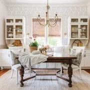
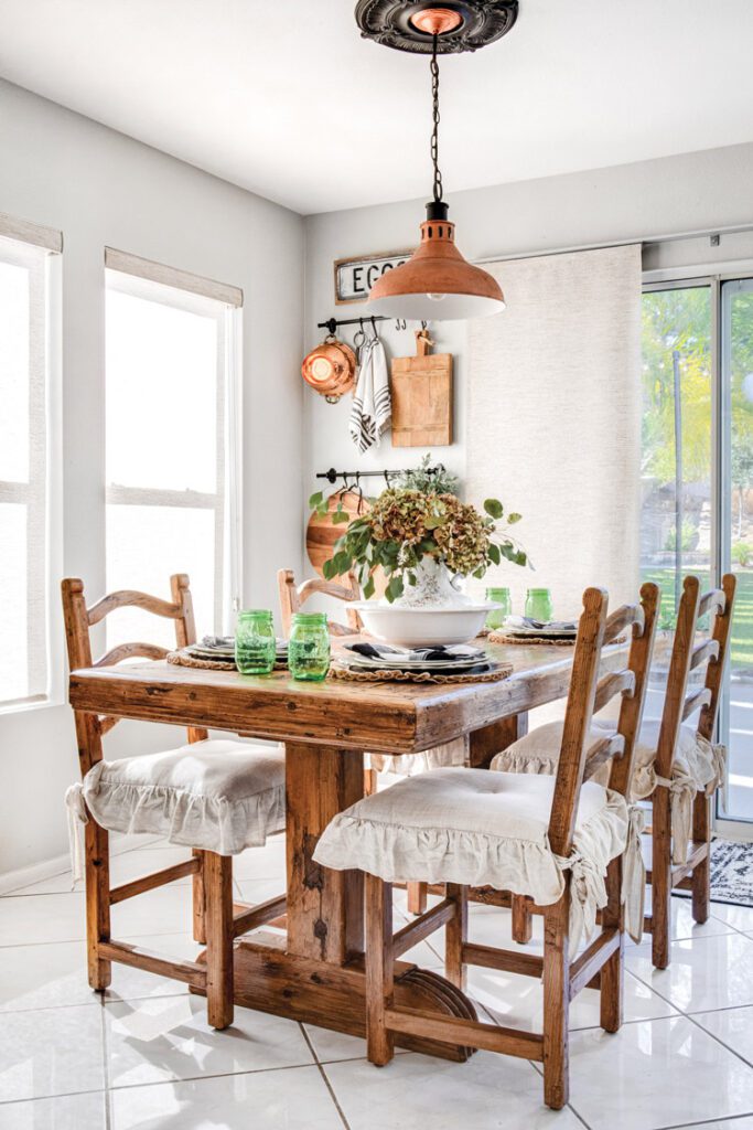
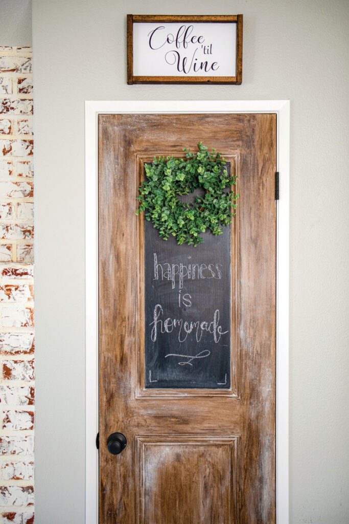
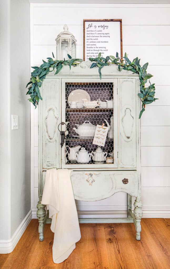
While the kitchen got a full renovation, the breakfast nook shows the power of Ana’s styling abilities. Her changes to the nook were mostly cosmetic, yet it looks nothing like the bare-bones space it used to be. A rugged table is a visual treat and, at the same time, a sentimental piece. “The table was an old Spanish door and used to belong to my parents,” Ana says. “I used to do crafts on it while growing up. Eventually, my parents got a different table, but I asked them to keep it for me. I’m so glad my parents indulged my 9-year-old self.”
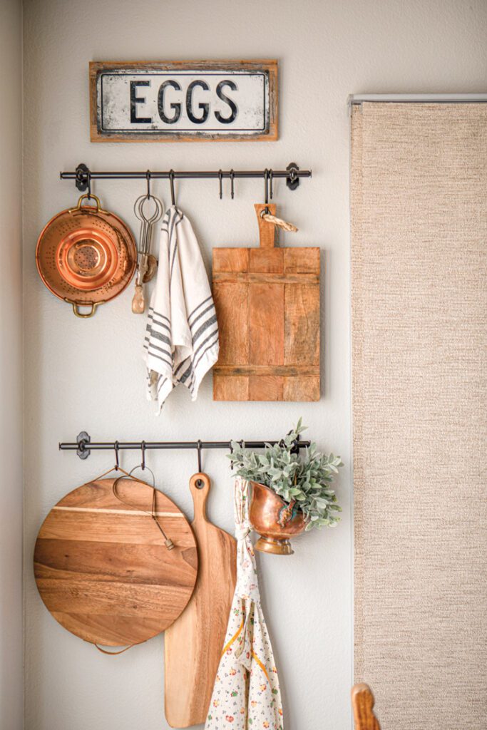
Behind the table are hanging racks, which Ana installed in anticipation of her growing copper cookware collection. “The racks are useful for hanging breadboards and any larger items that take up a lot of cabinet space,” she says. Since she frequently makes charcuterie boards when entertaining, it’s important to keep the breadboards easily accessible, along with a colander. These details combine to create a breakfast nook that’s beautiful without being fussy and is just the place to begin the busy day with a hot cup of coffee.
No Longer Blah
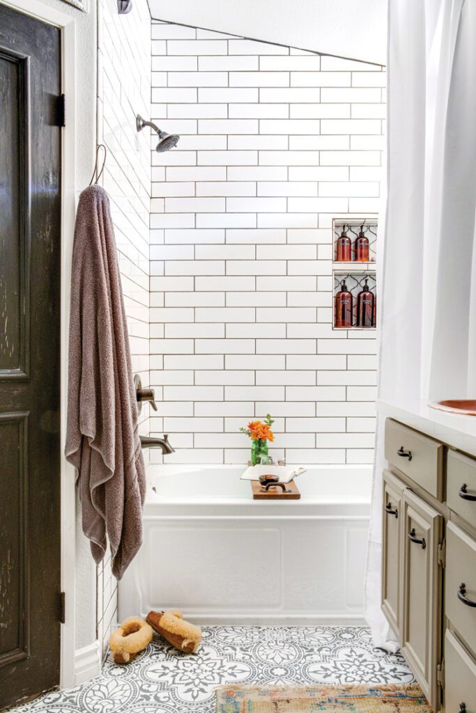
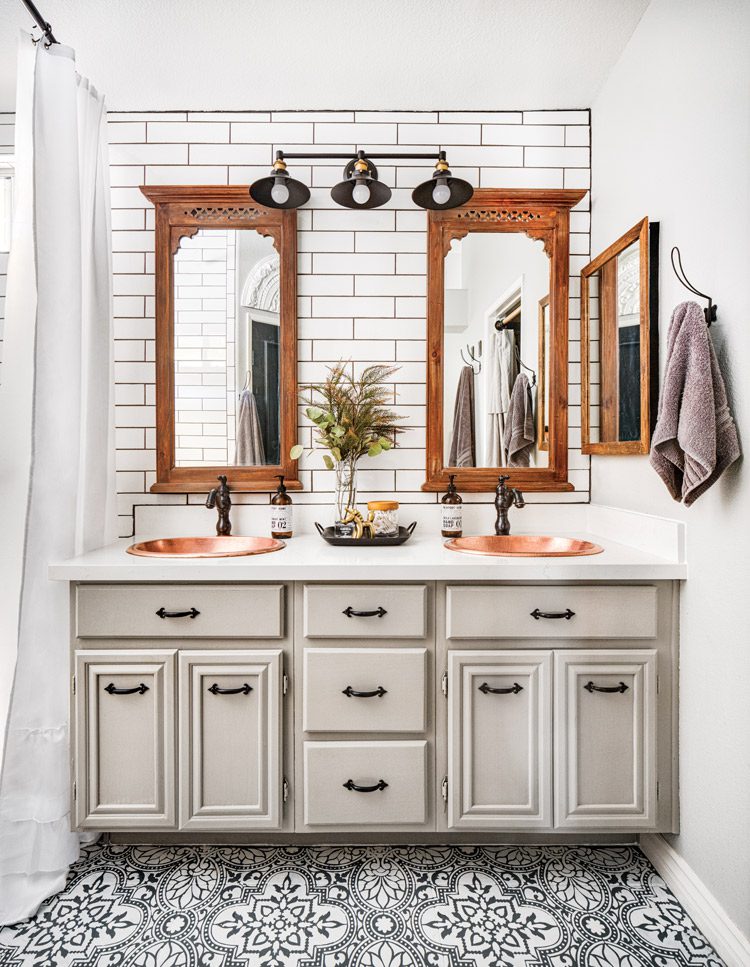
The pre-existing master bathroom was the epitome of blah, with a fiberglass tub and shower, dingy white cabinets with no hardware and cream Formica counters. Ana and her husband changed everything from top to bottom. They installed an acrylic tub in place of the old shower/tub combo, tiled the shower and sink wall, and added new mirrors, lighting, sinks, counters and fixtures.
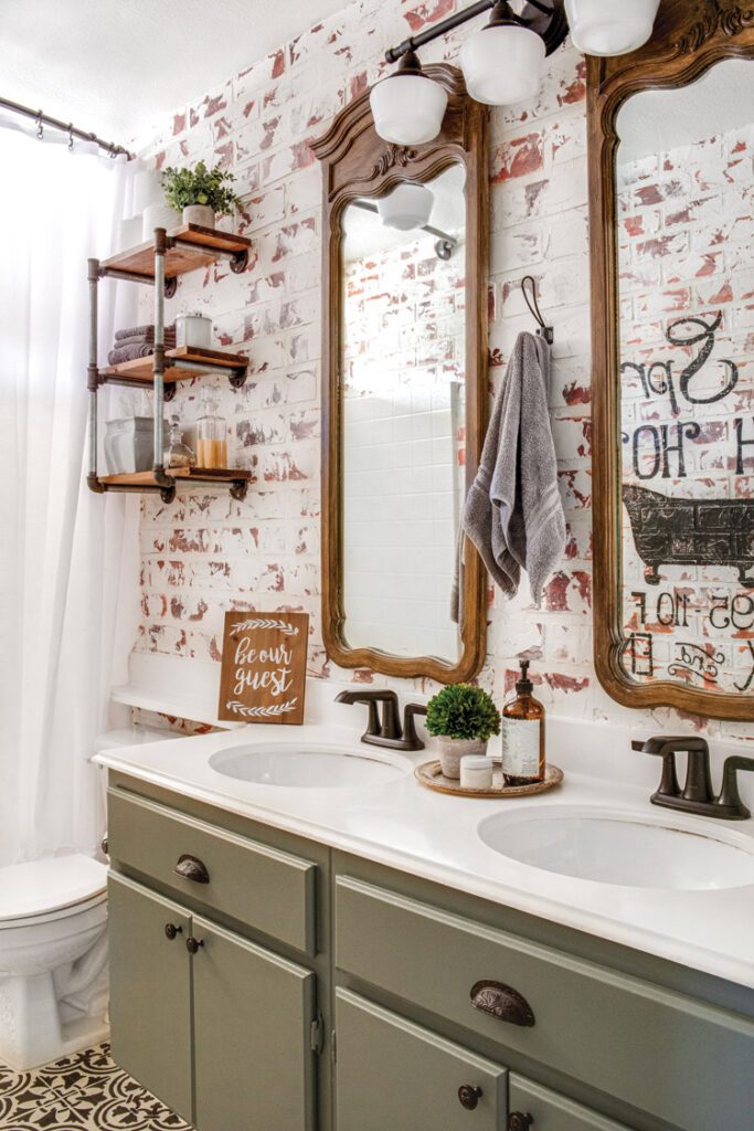
“Our renovations prove you can have a luxurious master bath that packs a style punch in a small space,” Ana says. “We don’t have the advantage of a giant master bath here, but it still feels luxe and classy and relaxing.” Copper sinks, along with wood components and white tiling, create a serene escape that’s full of vintage elegance.
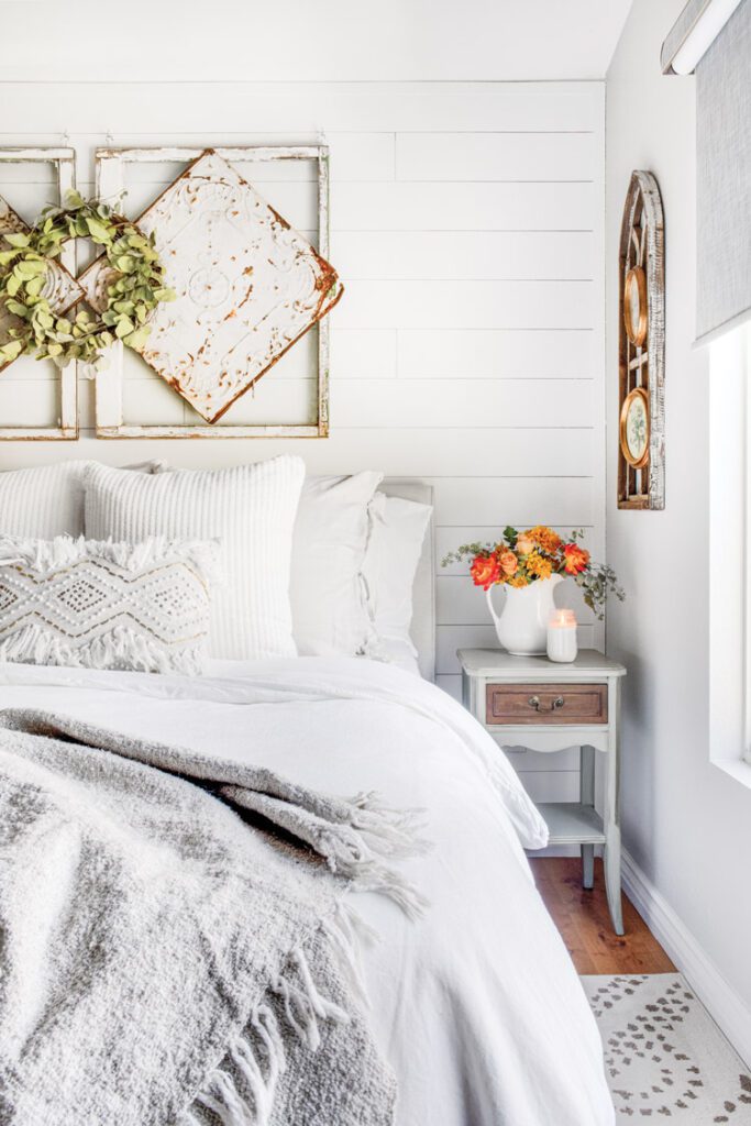
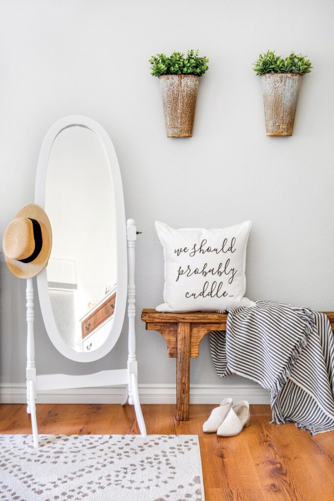
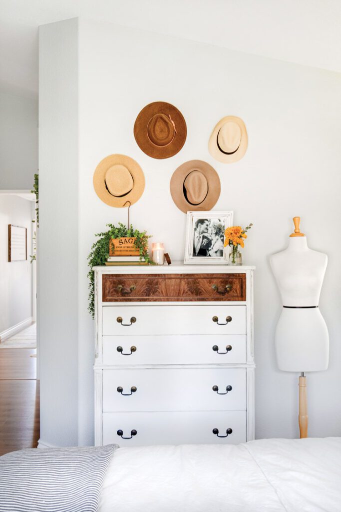

Through DIY renovations and styling, Ana shows exactly how to attain a custom look, even in a basic-build home. She hopes others will be empowered to create their own dream homes, right where they live. As she says, “Just go for it. My DIY motto is ‘Everything can be fixed.’ So if you make a mistake or don’t like something after the fact, you can always change it.”
Updating Builder Grade
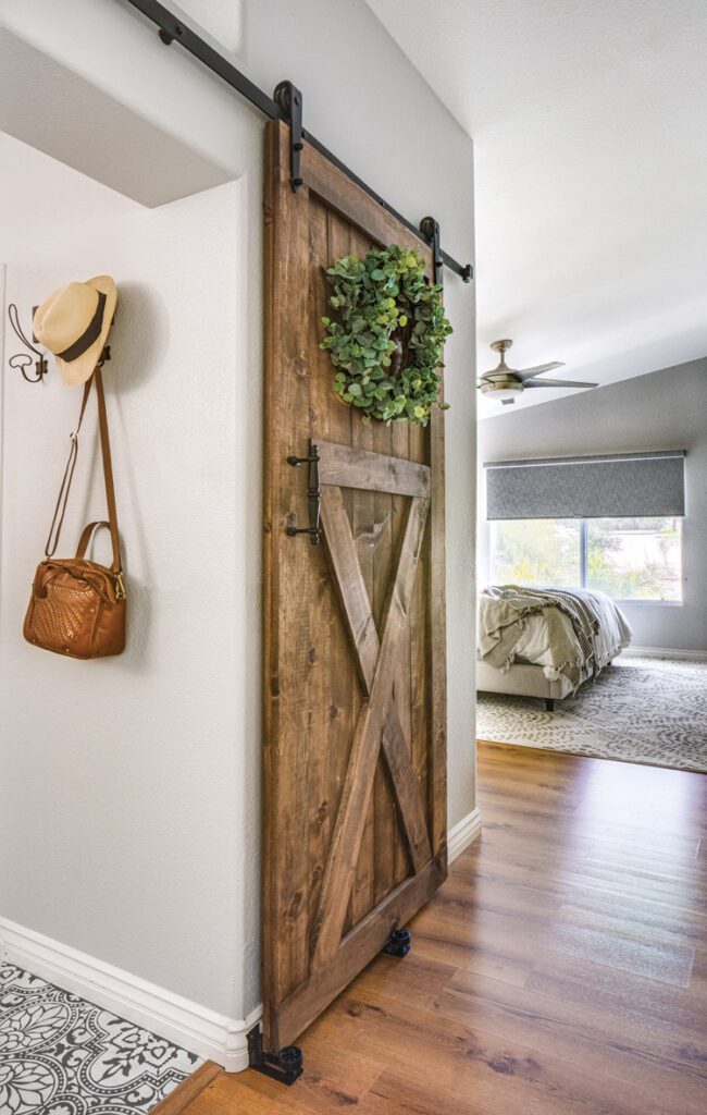
Ana’s home is an example of how to customize builder-grade architecture. Here are her five top tips for working around basic builds without doing major renovations.
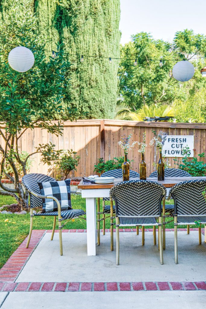
“I’ve always loved home styling and crafting, but this house was my first foray into real home renovation. Now I’ve tried pretty much every power tool out there.”
- Paint. Paint can do wonders for a space, and you can really paint anything—from the walls and floors to the cabinets and furniture. You can even add paint to materials like tile, brick and concrete for a custom look.
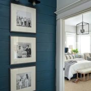
- Wall treatments. Add an easy accent wall like shiplap, board and batten, faux brick or beadboard. One reason old homes have charm is because they’re full of molding and extra handcrafted details. “You can add that very easily to a builder-grade home for very little money,” Ana says.
- Think outside the box. “I never anticipated I’d be able to get rid of our ugly brown granite countertops with just a little bit of elbow grease and some concrete,” Ana says. Now their concrete counters are perfectly farmhouse (and are holding up well over 2 years later). “There really is a project/solution for everything,” she says.
4. Change the light. Lighting can add so much character to a space without breaking the bank. “You can buy an easy converter kit to convert can lights into hanging fixtures,” Ana says. “We did this over our kitchen sink and above the table in our breakfast area, and it added much-needed character to the otherwise boring and builder-grade space.” Adding wall sconces is also a great trick to bring in Old World charm. Plug-in sconces can be an easy way to bypass the need for hardwiring.
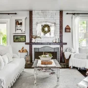
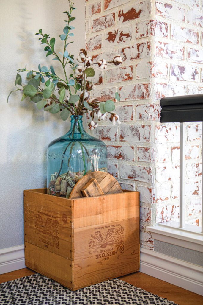
5. Shop your home. Use furniture and accent pieces to tell a story. Sometimes you just have to work with what you’ve already got to get DIY renovations. “Using your own personal style, you can transform your space with pieces that you already own,” Ana says. Add a few bouquets of flowers and greenery, and your house will instantly feel more like home.
Need more ideas for DIY renovations? See DIY Kitchen Remodel Tips and Renovation Delays: A Construction Reality. Of course, don’t forget to follow us on Instagram, Facebook and Pinterest for your daily dose of farmhouse inspiration!

